Reusable Components
Creating Components is a powerful feature in BuilderX. It allows you to create reusable components that can be used multiple times easily across your project's screens and pages.
A Component can be a group of layers which can be made reusable.
The best example for the Components are the Header, Footer of an app which are used across all the screens. An example is made using BuilderX and is shown below:

To create a Component in BuilderX, first select the group of layers/views that you want to convert into a re-usable component.
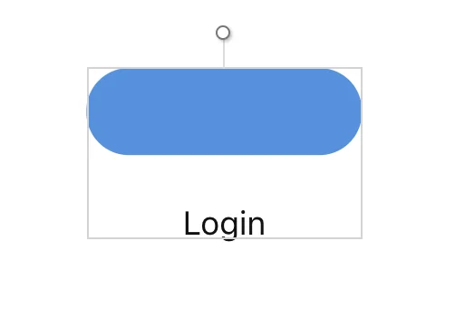
Creating Component
Click the Create Component in the center of the Toolbar.

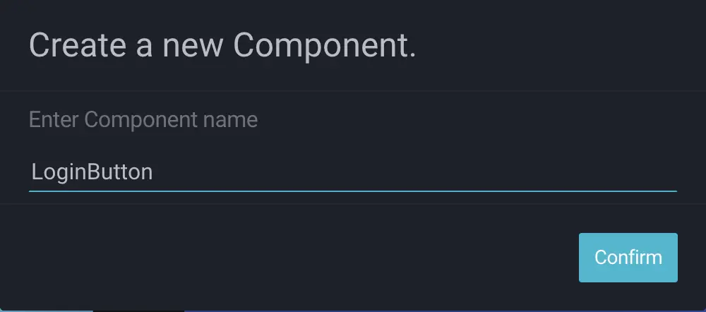
BuilderX will show you a pop-up where you can give a name to the Component. The Component
will be referenced everywhere in your project by this name. Component also creates a
separate file in src/symbols.
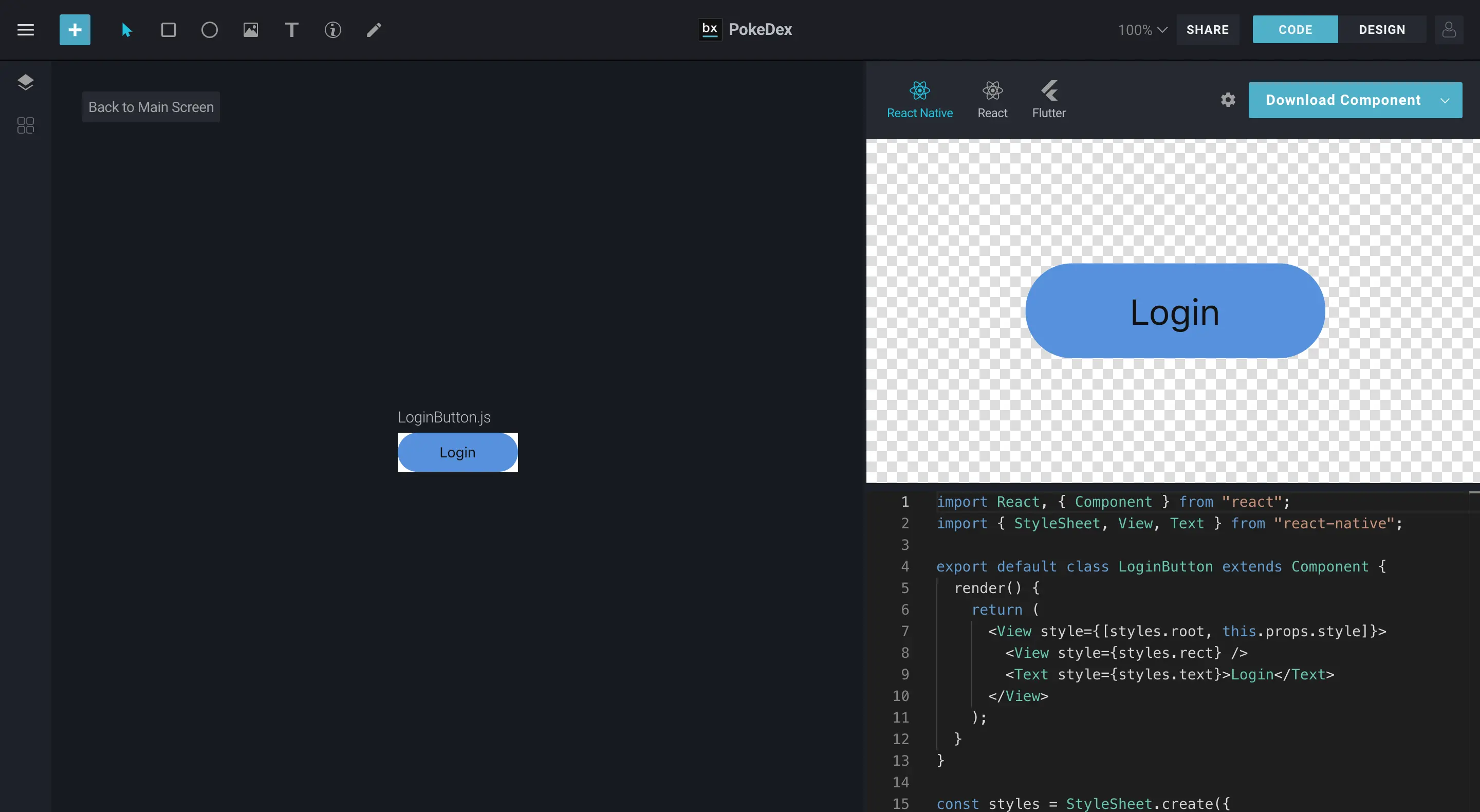
BuilderX replaces the selected layers with the Component name from the Layers & Components panel and the Code Editor. BuilderX also imports the Component file from `src/symbols' and an instance of the same file is used.
You can double click on the component created to view it.
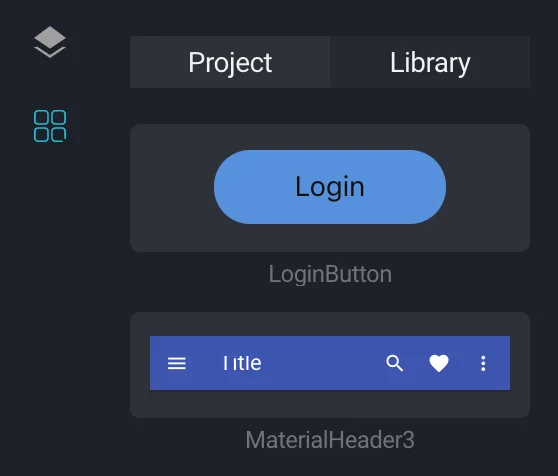
You can also view all the created symbols in the left panel under the Project Tab in the
Component Library
Editing Components
To Edit any Component made with BuilderX, you can double click on the Component on the Artboard and BuilderX will open the Component Editor view in Component Context.
You can edit layers inside Reusable Components in a similar way as you would do for normal layers. You get the appropriate options in the Design Panel based on the Layer selected.
Renaming Components
You can rename any of the layers in BuilderX regardless of their Context i.e. Group of Layers, Reusable Components etc.
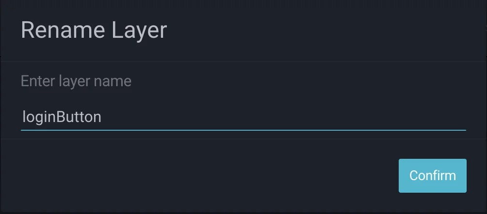
Select the layer in the Layer list on the Layers & Components Panel and Double click on it to show a pop-up where you can rename the layer.
Video Series
You can also check the video series covering Reusable Components in BuilderX.