Special Operations
This section explains in detail, different operations that can be performed in BuilderX that will help you create your dream app.
You can find information on operations on the following:
- Artboard.
- Rectangle.
- Touchable Opacity / Clickable Button.
- Text.
- TextInput.
- Icons.
- Images.
- Ellipse.
- Snap To Grid/Layer/Document Bounds.
Artboard
BuilderX's Artboard takes form of the device that you have selected from the Design Panel. You can choose any device from the latest flagships with Android or iOS & BuilderX's Artboard will adopt the same design from that device's specifications.
Artboard in BuilderX corresponds to React Native/React Component, which is a particular screen of your mobile application.
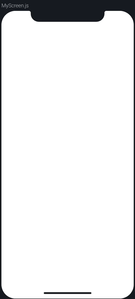
Renaming Artboard
In BuilderX, each Artboard has its name on the top-left corner of the Artboard. You can double click on the name and a pop-up will be displayed.
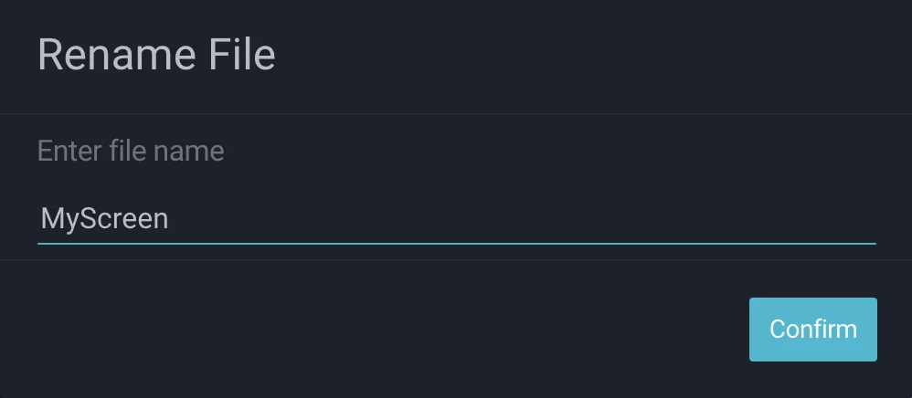
You can give an appropriate name to the Artboard and BuilderX will update all references of it.
Changing Device
iPhoneX is selected as the default device in BuilderX. You can change your device preference by navigating to the Design Panel > Device Editor.
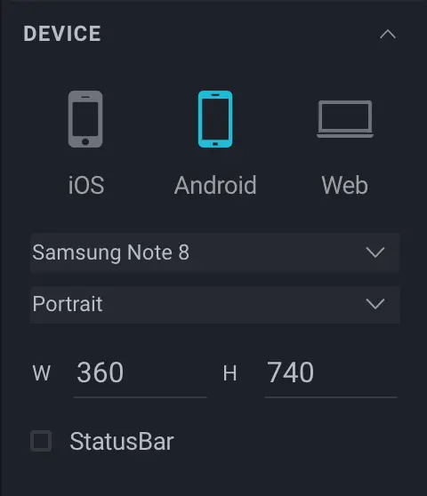
You can first change the type of the OS that you want to select and based on the OS, BuilderX will populate the list of current flagships in the dropdown in Device Type.
To change the selected device, click on the desired device name in the device list.
Following devices are available in BuilderX for iOS and Android respectively:
IOS
- iPhone X(Default)
- iPhone XS
- iPhone XS Max
- iPhone XR
- iPhone 8 Plus
- iPhone 8
- iPhone 7 Plus
- iPhone 7
- iPhone 6s Plus
- iPhone 6s
- iPhone 6 Plus
- iPhone 6
- iPhone 5s
- iPhone 5c
- iPhone 5
- 12.9 iPad Pro 2018
- 11 iPad Pro 2018
- 12.9 iPad Pro 2017
- 10.5 iPad Pro 2017
- The iPad 2017
Android
- Samsung Note 8 (Default)
- Samsung Galaxy S8 Plus
- Samsung Galaxy S8
- Samsung Galaxy S7 Edge
- Samsung Galaxy S7
- Samsung Galaxy S6 Edge Plus
- Samsung Galaxy S6 Edge
- Samsung Galaxy S6
- Nexus 5
- Nexus 5X
- Nexus 6
- Nexus 6P
- Google Pixel
- Google Pixel XL
- Google Pixel 2
- Google Pixel 2 XL
- Google Pixel 3
- Google Pixel 3 XL
- OnePlus 5
- OnePlus 5T
- OnePlus 6
- OnePlus 6T
Status Bar
BuilderX comes with the Status Bar preview in order to view the precise design while building the app. You can enable/disable the preview of Status Bar in the Design Panel in the BuilderX workspace.
You can do so by clicking on the checkbox next to Show Status Bar to view the Status Bar on the Artboard.
Android Status Bar
When Device OS type is Android, The Device Tool will be rendered as shown below:
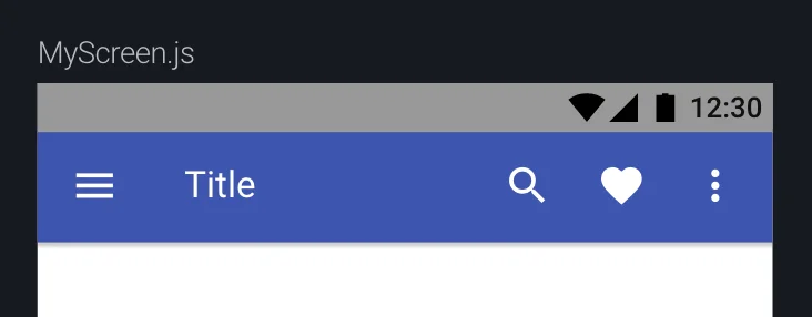
You can give a background color to the Status Bar when the device type is Android by clicking on the color picker next to Background Color shown in above image and set the desired color.
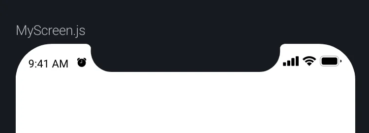
iOS Status Bar
For IOS, the background is translucent by default,so that it adjusts to your application design background. BuilderX takes that default setting as the status bar on your artboard.
Bar Style
You can specify the type of the content in the bar. For example, for darker
backgrounds, you can choose light-content and for lighter backgrounds,
dark-content respectively.
Rectangle
Adding Rectangle
The easiest way to add a rectangle is to pick the rectangle shape from the Toolbar. Choose Insert > Shape and select Rectangle(or press R). You will see the pointer change to the Draw Rectangle tool icon +.
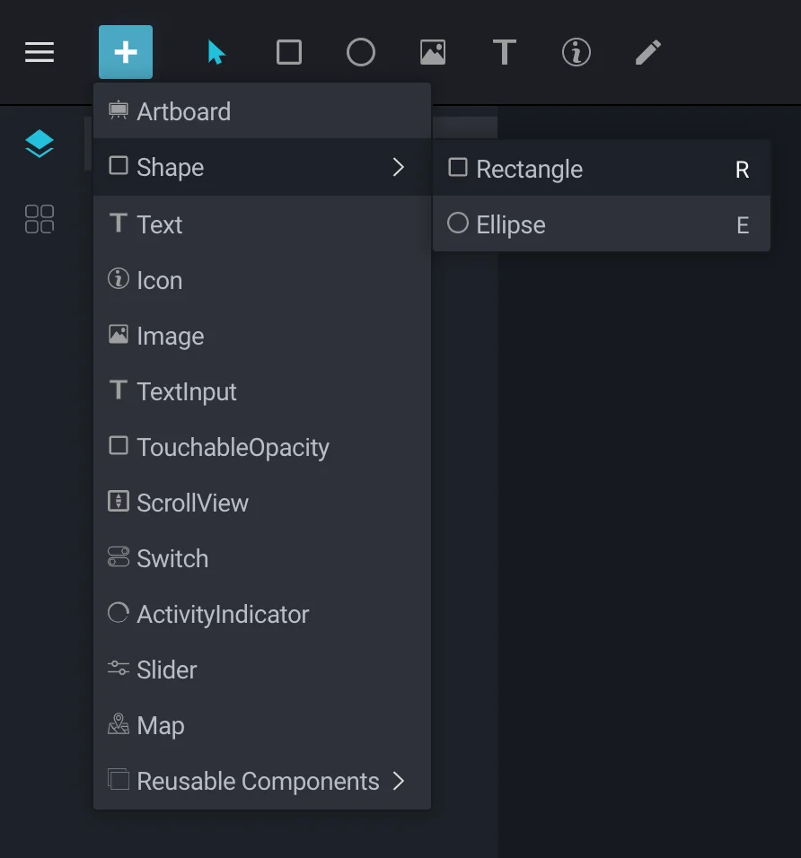
Now click on the Artboard and drag to insert your shape. When you release the pointer, the shape will be inserted and you can start manipulating it in other ways.
You can also click on the Artboard when your pointer tool is set to + and a pop-up will appear asking you to enter the desired dimensions of your rectangle.
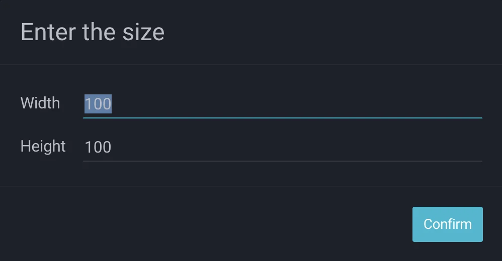
Providing the Width and Height will automatically be applied as the dimension of the inserted layer.
Text
Adding Text
You can add text by choosing the Text tool from the Insert pop-up menu in the toolbar (or press T). The
pointer changes to the Text Input tool icon and then you can click anywhere on the Artboard to insert your
text layer at that point. A new text layer will be inserted with Text Added already selected,
ready to replace.
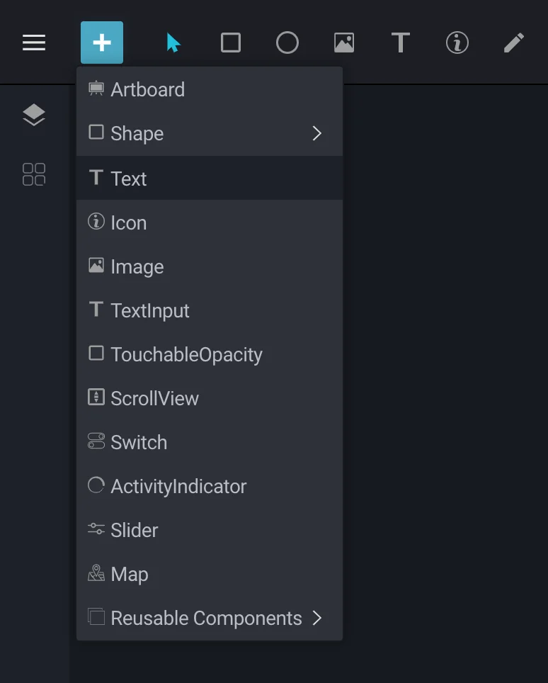
You can also click-and-drag to create a text box of a fixed size. When the text gets too big to fit inside the box, it will create a new line, as opposed to a normal text box which increases its width to fit the content.
Resizing Text
When you resize a text box in the Canvas, its text size will not change. To change the text size, you must edit the text size value in the Design Panel.
In BuilderX, you can align text horizontally, vertically or centrally. In addition to this, you can also adjust the text alignment and determine whether the text should be at a fixed or automatic width/height.
Editing Text
When you have a text layer selected, you will notice that the Editor in the Design Panel changes to display all the properties that apply to a Text layer.
Under those, you can choose and apply the various text properties that you would expect, such as typeface (font-family), weight (e.g. light, bold, italic) and the font size. Additionally, you can also adjust text alignment, determine whether the layer should be at a fixed, or automatic width and adjust character, line, and paragraph spacings.
Text Color
When you’re editing text, you can apply specific colors to the text by using the Color button.
Text Alignment
In BuilderX, you can align text horizontally as well as vertically. In order to see the changes to a text layer’s alignment, you can set the text box to either Auto or Fixed.
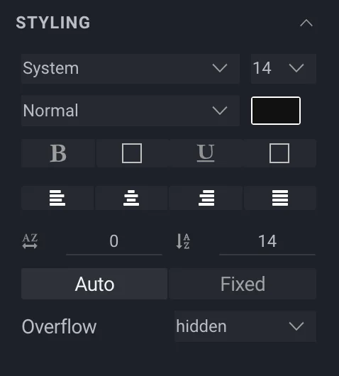
When the alignment is set to Auto, the text box’s width will expand as wide as possible to fit the text you entered, and the horizontal alignment is taken into account when you type.
When the alignment is set to Fixed, you can click and drag the handles that appear on the Artboard to adjust the height and width of your text layer. When entering text, it’ll wrap around the box and a new line will be created when the text can’t fit in the width.
As well as being able to adjust the horizontal alignment, text can be aligned vertically to the top, middle, or bottom when you have given the text layer a Fixed height.
Fonts
BuilderX uses Google Fonts to render text. You can also use local fonts using BuilderX Desktop Manager.
Text to TextInput
The Editable checkbox, when checked, converts simple text in code to a TextInput field, which is explained below.
Text Input
TextInput is a component that uses the keyboard to input text into an app. It provides configurability and lots of different features that make it versatile. You can find all its features here.
Icons
When an icon is selected, the Design Panel shows familiar options with some new ones. The Change Icon button allows you to replace the icon selected without changing its position on the artboard. The Styling option allows you to change the color, size as well as manage overflow for the icon.
Image
Images are also supported in BuilderX as a layer. Images can be of many forms, such as screenshots or photographs, and cannot be edited or manipulated.
You can add an Image by choosing the Image tool from the Insert pop-up menu in the Toolbar (or press P). The pointer changes to the Image tool icon. You can then click anywhere on the Artboard, followed by a dialogue box to choose the image you wish to insert, upon selection of which a new Image layer will be inserted.
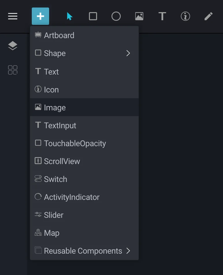
To replace an image in BuilderX with ease, simply select Change Image in the Image Editor in the Design Panel.
Resizing Image
Determines how to resize the image when the frame doesn't match the raw image dimensions.
To start editing an image, select Resize Mode under Image toolbar. You can also manipulate images freely.
The Resize Mode allows you to resize image with options like cover,
contain, stretch, repeat and center.
-
Cover: This will scale the image uniformly (while maintaining the image's aspect ratio) so that both dimensions (width and height) of the image will be equal to or larger than the corresponding dimension of the layer.
-
Contain: This will scale the image uniformly (while maintaining the image's aspect ratio) so that both dimensions (width and height) of the image will be equal to or less than the corresponding dimension of the layer.
-
Stretch: This will scale width and height independently, This may change the aspect ratio of the source Image.
-
Repeat: This will repeat the image to cover the frame of the view. The image will keep it's size and aspect ratio.
-
Center: This will center the image in the view along both dimensions. If the image is larger than the view, scale it down uniformly so that it is contained in the view.
Change Image View
To start editing an image, select properties from Design Panel which allow you to edit width, height and
alignment of the imasge. You can also apply border width , border radius ,
overflow and opacity properties to your images.
Ellipse
Adding Ellipse
The easiest way to add an Ellipse is to pick the Ellipse shape from the Toolbar. Choose Insert > Shape and select Ellipse(or press E). You will see the pointer change to the Draw Ellipse tool icon : heavy_plus_sign:.
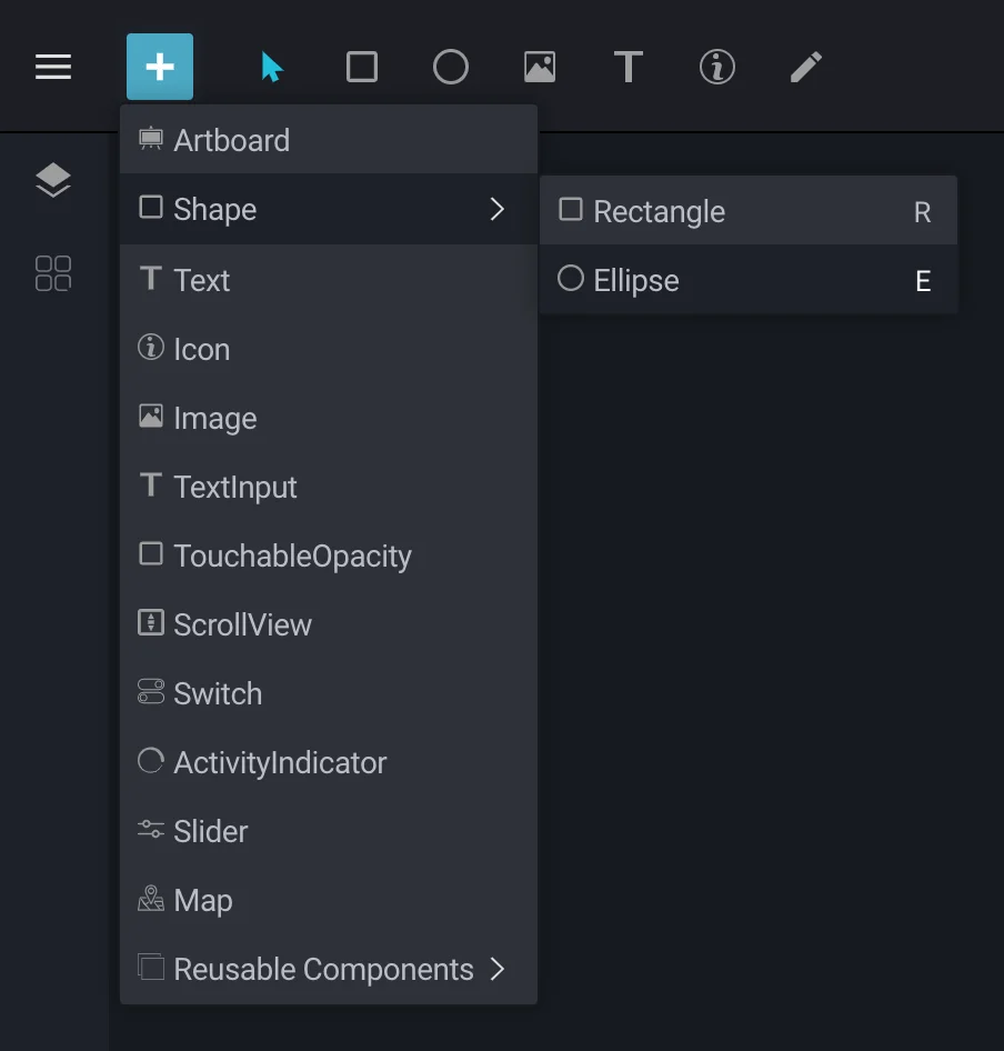
Now click on any point on the Artboard and drag to insert your shape. Upon releasing the pointer, the shape will be inserted and you can start manipulating it in other ways.
Snap To Grid/Layer/Document Bounds
To align the layers pixel-perfectly, BuilderX provides four ways to snap layers:
- Snap to Grid
- Snap to Layers
- Snap to Document
- Snap to Gutter
- Snap to Ruler
You can turn on Snap from Menu > View > Snap.
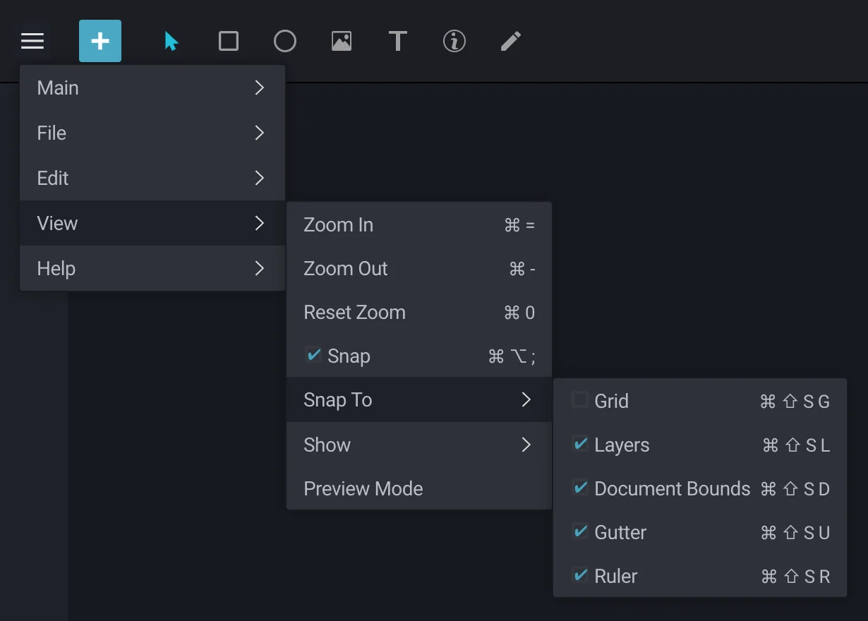
Snap to Grid
Snap to Grid allows you to snap layers to Grids that divide the Artboard into parts of 3 px by default. You can change these settings in Preferences.
Snap to Layers
Snap to layers allows you to snap the selected layer to other layers.
Snap to Document Bounds
Snap to Document Bounds allows you to snap to a Document and to perfectly align it to the middle (vertically or horizontally), to the edges and top, to the right, bottom or left of the Selected Artboard.
Snap to Gutter
This feature is used to maintain equal distance between three or more layers You can select any of them in any combination as per your choice.
Snap to Ruler
Snap to Ruler allows you to snap a layer or multiple layers to the position of the Ruler on the Artboard. You can select any of them with any combinations, as per your choice.